
In the last 5 years I as Product Manager, I often found myself disliking the common ways on how to express project status and deadlines. They’d either hide important complexity or are a mess to keep up to date. Over time have grown a visualizations technique and meeting format I call the Weekly Dependency Chart. This helped me get structure and overview in projects I inherited, that were complex, late or required reliable schedules. I applied this in several private and professional contexts successfully. It was originally inspired by the Puzzle Dependency Charts used by Ron Gilbert in his adventure games.
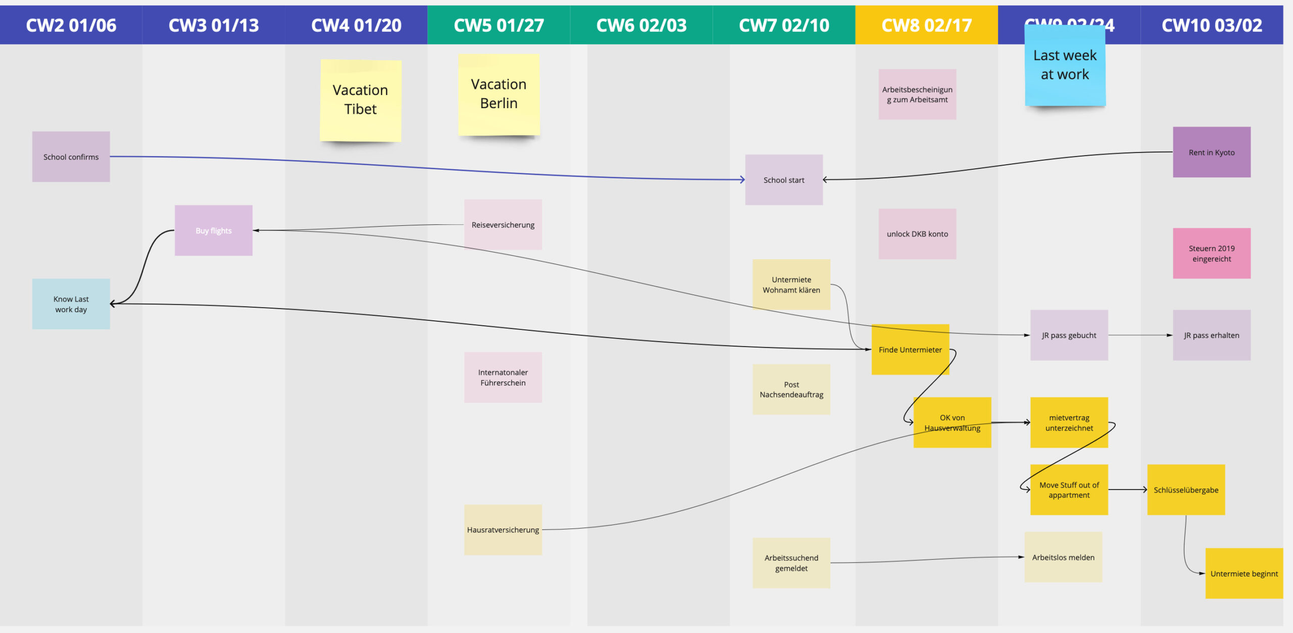
The idea is to have a quick high level overview of timelines, to-dos, blockers all lined up in a weekly calendar view. Each item connected to the items it’s dependent upon.
Over time this graph evolved into a meeting structure, you can use to keep the overview up to date while synchronizing the status with the people involved.
Setup
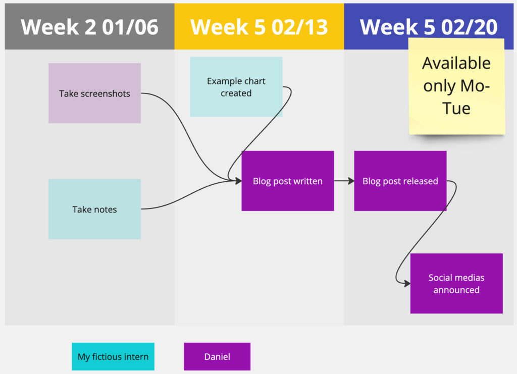
My setup is usually in Miro, Mural or any similar whiteboard software. You can also use a pin board and red strings.
It builds on a simple table: week number and starting date in the column head and a lot of free space below. Within each column are the items containing the actual to-dos. Ownership is communicated by color (or texture if the software allows which is better for color blind people). A Todo-Note is to be put into the week coloumn for which it should be finished. Finished to-dos are made 50% transparent and remain in the week of their finishing. This way it’s easy to see what was accomplished each week and what is in the weeks ahead.
Todo-Notes are then connected with each other reflecting their dependencies.
Todos and connections follow these simple rules:
- Any to-do can be required by multiple other to-dos.
- Any to-do can be dependent on multiple other to-dos.
- A todo-note can only be finished if all its predecessors have been finished.
- No to-do can have a predecessor in the future.
- Any to-do has one ultimate owner.
- The current week is highlighted.
- Past weeks may only contain finished to-dos.
Additionally I like to add notes to the chart to provide context. For example marking deadlines, vacation times, holidays or milestones.
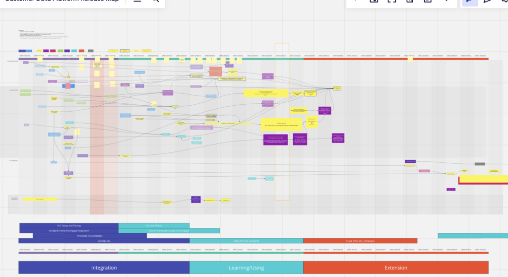
On a complex project with many dependencies, this can become crowded. In that case I split the week columns into multiple rows reflecting main workstreams or departments.
This chart is made with projects in mind who have a clear ending. As such you could have a final end card, that is only finished, once all dependent to-dos are done. Realistically, in my projects, in the final phase, as to-dos moved from the project scope into continuous development, the Weekly Dependency Chart (and its meetings) just fizzle out as it outlives its usefulness.
Meeting flow
Originally, I only used this chart for myself to get structure and overview into complex projects. As I showed and discussed this with colleagues, we began to integrate it into our weekly Jourfixes. Everyone having tasks in the Dependency Chart would participate in this weekly update meeting, together we’d maintain it and use it as the jumping off point for discussions.
As moderator, in the first half of the meeting, I’d go through the current week and ask every participant about their updates. Either they already have their to-do cards up to date, or we update it quickly during the meeting – usually by giving a short progress report. No open to-do notes should remain in past weeks. If the to-do is not finished its card either has to be moved to the current or a future week. Dependencies on the card will have to move accordingly and prompt a discussion about the consequences to the project down the line. This way you have a very easy tripwire to recognize upcoming issues in your project plan early.
At the end of the first half of the meeting, all to-dos of the past week have been marked as done or have been moved.
In the second half, we look at the current week with the question “With all the tasks, that have been moved, is it realistic finish everything in the coming week?” To-dos tend to bunch up and this is a great visual indicator to see, how a project is beginning to lack behind. In this discussion everyone can reflect, if their expected tasks are realistic to finish. Ideally the moderator learns over several weeks, how reliable the participants are in terms of delivering their to-dos and how well their time estimations are.
If the bunch-up can only be resolved by moving tickets to the future or removing tasks. This may result in discussions outside the meetings about the project plan. This meeting format lends itself for identifying risks and delays early. If these risks can directly be adressed depends on the size of the project.
By the end of the second half, you have all the tasks for the upcoming weeks moved ahead reflecting an ideal implementation path.
When you zoom out, your chart can tell you several things about your project:
- A To-do card dependent on many other to-dos indicates a high importance to the project, you can view it as a bottleneck or as natural candidate for a milestone.
- To-dos bunching up in one week are a an indicator that a review of the projects timeline or scope may be required soon.
- Having many to-dos in a week that are dependent on each other indicates this week being very risky as interruptions can lead to re-scheduling easily.
- If most to-dos are of the same color, it means a lot of responsibility is on one person. Maybe split the work in your team better?
- Cards without dependencies are great as jumpers who can be moved ahead if people are blocked by other to-dos.
After the meeting, I like to do a screenshot of the visualization. This is not mandatory, but allows later comparisons between the current document and earlier expectations. This can be used as evidence for a later retrospective to discuss on why certain tasks didn’t finish when expected.
I made good experience of this meeting format with 2-6 participants.
Limitations
I regard this visualization as one more option in my toolbox, it certainly does not fit every occasion. It’s an opinionated simplification focusing on deliverables, reliability and synchronization.
There are several things, this does not do. First and foremost, it does not indicate how long a task will take. It only shows by what time it is expected to be done.
While similar in approach to Gantt charts, the level of detail in both visualizations is very different. Gantt is more detailed, but takes much more effort to set-up and maintain. The Weekly Dependency Chart makes it easy to shift to-dos and dependencies – something often a pain in Gantt, discouraging changes.
To people looking at Gantt charts, the rigor of the project plan may suggest a maturity/stability often not actually present (in software projects anyway). It is easy to interpret the given time estimates as promises. The Dependency Chart simplifies to the most important steps and highlights the agility of the plan while providing clear deliverables.
Lastly, the chart is best for a project with defined ending over a span of up to 9 months and with up to 8 managing people. For bigger projects, it could be worth trying to break the project into smaller parts, that could fit the format again, but I haven’t tried that yet.
This is best used in a waterfall project, but can also applied in iterative projects.
I wouldn’t use it for Agile projects or in combination with Scrum.
TLDR
The Weekly Dependency Chart is a cheap visualization of tasks and their dependencies in a project. It’s best for projects of 6 people over 6 months. The chart offers a great basis for weekly jourfixes on the projects and gives a great basis for timeline discussions in risky projects.
- Meeting format offers structured way to request weekly updates
- Tripwires to discover when projects plans are at risk of running late
- Easy updates encourage more reliable project status